People first notice wall art placement as they walk into a room. Research shows that 68% of homeowners value wall art that creates a harmonious look with their furniture. Another 55% lean towards bold, contrasting pieces that stand out. These numbers tell an interesting story – there’s no single right way to do it!
Wall art arrangement can reshape your space dramatically. A well-placed piece becomes one of the simplest ways to give your room a fresh look. The right positioning makes a significant difference, whether you’re showcasing a large piece above your sofa or designing a gallery wall. Art experts suggest hanging pieces at eye level – about 57-60 inches from the floor.
This piece will show you reliable strategies to arrange wall art beautifully in every room. You’ll discover simple principles and sophisticated techniques that help you create spaces matching your style while respecting proven design guidelines.
Why Wall Art Placement Matters
Wall art placement can turn an ordinary room into a captivating space. Your artwork works as visual punctuation that changes the room’s dynamics, similar to how a well-placed comma changes a sentence’s meaning. Art does more than decorate – it carries memories, power, and personal identity.
How wall art affects room balance
Well-placed artwork fine-tunes a room’s ambiance by creating harmony between different elements. Wall art brings balance to texture, pattern, and color and adds depth to spaces with flat or bare walls. The right art placement can anchor a room’s layout, which draws attention and defines focal points.
Your walls serve as a curatorial canvas—each one tells a chapter of your home’s story. Large, bold pieces naturally draw attention as focal points and guide the eye across the space. The interplay between artwork and its surroundings—wall color, lighting, and furniture—adds to the subtle atmosphere that changes a room’s mood.
Art’s talismanic power grows through unexpected adjacencies and positioning. Interior designers point out that artwork distribution helps achieve visual balance by filling empty walls and creating symmetry. The overall experience created by natural art arrangement becomes much greater than its individual parts.
Common mistakes in art placement
Several common mistakes reduce art’s effect:
- Improper height: Art hung too high breaks the visual flow. Museums hang art with its center at 57-60 inches from the floor.
- Inconsistent spacing: Random gaps between artworks create chaos. A gallery wall needs 7.5-15 centimeters between individual pieces.
- Poor proportion: Small art on a big wall looks unplanned rather than intentional. The rule of thirds helps—a 10-foot wall needs artwork at least 40 inches wide.
- Disconnect from furniture: Art should relate to furniture. Keep 4-8 inches between frame bottoms and furniture tops.
- Reflective glass near light sources: This makes art hard to see. Choose paintings or textile pieces that absorb light for walls near major light sources.
These mistakes, when fixed, let each piece stand out and create a balanced, appealing arrangement.
The Core Principles of Wall Art Arrangement
You can create professionally designed rooms by becoming skilled at the simple elements of wall art placement. Here are three key principles that will change how you arrange your artwork.
Varying scale and orientation
A successful art arrangement needs consistent dimensions. Your artwork size should complement the wall space – oversized pieces hide details while tiny ones blend into the background. The “rule of thirds” helps you find the right size. Simply divide your wall width by three to find the minimum artwork width. A 10-foot wall needs pieces at least 40 inches wide.
The way you orient your art affects how people see the room. Horizontal pieces make spaces feel wider and more peaceful. These work great above longer furniture pieces like beds or consoles. Vertical pieces pull your eyes up toward the ceiling and add some drama to the space. The best results come when your art’s orientation matches your wall’s shape.
Balancing symmetry and asymmetry
Symmetrical arrangements create a refined, formal feel with similar frames on both sides of a center point. This approach offers simple elegance but might feel too predictable. Asymmetrical layouts add unexpected energy and visual interest to your space.
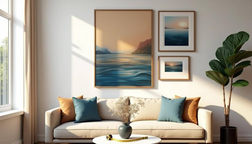
One way to achieve harmony is through a carefully chosen set of 3 wall art, which introduces balance while still leaving room for creativity. Collections like those available at Art by Maudsch are designed to bring cohesion without overwhelming a room, making them an excellent choice for living areas and bedrooms alike.
The key to asymmetrical balance lies in thoughtful weight distribution. Balance a large painting with several smaller pieces to create equilibrium without exact matching. Designers suggest using the rule of thirds – hang off-center art in either the right or left section while keeping the rest empty.
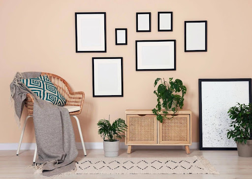
Spacing and negative space
Negative space – the empty wall area around art – plays an active role in your composition. This breathing room between pieces structures your arrangement and draws attention to the artwork. Gallery walls look best with consistent 2-3 inch gaps between frames.
Empty spaces give viewers’ eyes a place to rest and create rhythm across your display. Good spacing prevents cluttered looks and helps pieces flow together. The interplay between filled and empty areas lifts your entire arrangement to new heights.
How to Arrange Wall Art in Different Rooms
Each room in your home calls for a slightly different approach to wall art placement. The goal is to match the display with the room’s purpose, lighting, and available wall space.
Consider these ideas:
- Living room: Choose artwork that spans about two-thirds of your sofa’s width and hang it 4 to 6 inches above. Spacious walls benefit from oversized canvases that draw attention, while a set of three matching pieces can create visual flow. Asymmetrical arrangements add personality without dominating the room.
- Bedroom: Select peaceful nature scenes, soft watercolors, or neutral designs to promote relaxation. Symmetrical arrangements above the bed work especially well, such as matching artworks on each side of the headboard or a single centered piece. Tie the artwork’s colors to your bedding for a unified look.
- Dining room: Since guests spend time here in conversation and meals, bold art makes a lasting impact. A large statement piece adds elegance, while abstract works bring sophistication behind the dining table. Warm earth tones foster coziness, and rich jewel tones add drama to formal dinners.
- Bathroom: Opt for waterproof or washable prints that can withstand steam. Good placements include above the toilet, towel bar, or tub. Soft colors and natural themes create a spa-like feel, while sealed photographs or ceramic art provide durability in humid conditions.
- Kitchen: Bright, fun artwork enlivens the kitchen’s practical setting. Smaller pieces work well propped on shelves, counters, or arranged vertically on narrow walls. Food-themed prints, lighthearted quotes, or colorful accents add energy. Mounted kraft paper rolls or chalkboards can combine style and function while bringing personality into the space.
Advanced Tips for a Cohesive Look
Simple placement principles won’t create a sophisticated art display. These advanced strategies will help raise your wall art arrangements to professional levels once you understand the basics.
Mixing art types: paintings, mirrors, sculptures
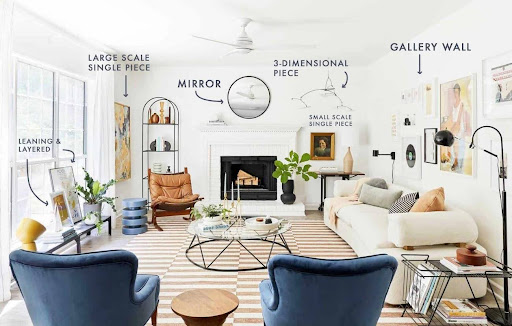
Wall arrangements need diversity to catch the eye. Your display becomes more intriguing when you blend different genres, time periods, scales, and mediums. Think of wall decorating as choosing from a “menu” of display options—you can combine statement pieces, gallery walls, and art objects such as mirrors or sculptural items.
All the same, no two similar display types should compete for attention in the same space. Different frames highlight each piece’s uniqueness when purposefully mismatched.
Choosing a color palette that flows
A cohesive color scheme connects your art pieces like an invisible thread. The right wall art sets the perfect tone and stirs emotions in your space. Gallery walls work best when you maintain consistent tones and intensity—neutral colors, blues, and touches of gold create harmony. You could also pick a few dominant colors that appear throughout different pieces.
Layering and leaning art for depth
Layered art creates a casual, curated atmosphere. This approach adds texture and visual interest by overlapping pieces slightly. A central piece serves as your starting point. You can layer complementary items like plants around it. Different artwork sizes keep things interesting—larger pieces anchor the display while smaller ones fill the spaces between.
The Lasting Effect of Thoughtful Placement
Wall art does far more than fill a blank wall. It shapes the character of each room, creates balance, and provides a sense of rhythm that connects the home as a whole. When placement is intentional, even simple pieces can carry depth and meaning, offering a daily source of calm or energy depending on the mood you want to set.
The key is to combine principles with personal expression. Aligning art with the room’s function, paying attention to scale, and experimenting with symmetry or asymmetry allows your space to feel both polished and inviting. Your choices tell a story about who you are, while also ensuring that each room feels complete and considered.
With a little care and creativity, your walls can become more than decoration. They can turn into a quiet guide that shapes how every space is lived in and remembered.