
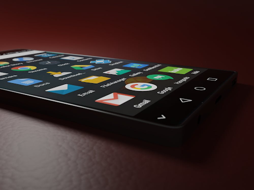
Pick up an Android phone and you see the story right away. The screen is bright, the icons are clear, and the tap feels natural. Good design sets the tone, useful functions carry the day, and simple usability keeps people coming back.
The same rule applies to business websites that Android owners visit. Agencies like Mendel Sites plan for that tap, scroll, and swipe. They design WordPress sites that look good on many screens, load quickly on mobile data, and help visitors do simple tasks without stress.
Clear Design Builds Trust
Android phones come in many sizes, from compact to big edge to edge displays. A site that looks neat on a range of screens earns trust fast. Clear typography at 16 to 18 pixels, strong color contrast, and generous spacing make content easy to read in bright daylight and at night.
Consistent visual rules help people predict what will happen when they tap. Think of a steady system for buttons, links, and forms. Material Design, which guides many Android interfaces, shows how shape, motion, and layout can make actions feel natural.
Images matter too. Use responsive images so the phone downloads only what it needs. Add short alt text so screen readers can describe the image. Keep decorative images as CSS backgrounds when possible, and avoid text baked into images so words stay sharp on high density screens.
Features that Solve Tasks
Popular phones feel useful because they remove small hurdles. A site should do the same. Map links should open the maps app, phone numbers should start a call, and email links should open the mail app with a clear subject line.
If you publish a menu, PDF, or price list, offer a clean HTML page as well so users can zoom, search, and share.
Forms need to be short and friendly. Use the right input types so the Android keyboard matches the field. Number pads for phone and card fields save time. Date pickers avoid parsing errors. Auto complete on city and postcode lowers typing.
A progress bar on multi step forms shows where users are and what comes next.
If your business schedules calls or demos, integrate a simple booking tool that blocks double bookings and sends a calendar invite. The best sites keep people inside a smooth flow instead of pushing them to download a file or switch to a desktop later.
Easy to Use on Small Screens
Thumb reach shapes mobile design. Keep the most used actions near the bottom of the screen. Make tap targets at least 44 by 44 pixels so links do not feel cramped. Space form fields so users can tap without fat fingers errors. Use plain labels above fields, not placeholder only text, so people do not lose context.
Readable content wins. Short paragraphs, meaningful subheadings, and bullets for steps help people scan. Avoid tiny buttons that hide behind pop ups. If you use a cookie banner, make it small, honest, and easy to dismiss. Do not block the whole screen just to ask for an email.
Accessibility helps everyone. Android users include people who use screen readers, zoom, color filters, or switch controls. Use proper heading order, label form fields, and provide focus states for keyboard users. Captions on videos help in noisy places and on silent commutes.
Speed that Feels Instant
Speed is a feature. Many Android users browse on mobile data in busy streets, trains, and cafes.
A slow site loses people before the first headline. Compress images, preload key fonts, and defer scripts that are not needed at the start. Set a performance budget so pages do not bloat as you add features.
Core Web Vitals are a practical way to track real user speed and stability.
They measure how fast the first content appears, how long the page takes to respond to input, and how stable the layout stays while loading. Google’s Web Vitals resource explains the metrics and thresholds in plain terms.
Service workers can cache assets so repeat visits feel instant. Even a simple offline page that explains what works without a connection can lower frustration. If you use video, offer a lightweight poster image and tap to play so data use is a choice, not a surprise.
WordPress Blocks that Scale
Many brands start on WordPress because it is flexible and easy to manage. The challenge comes later, when teams add pages, posts, and modules over time. A design system solves this by defining a shared set of blocks and rules. Buttons, forms, cards, and alerts come from one source, so they keep the same look and behavior across the site.
Reusable blocks also help authors publish faster with fewer mistakes. A pricing table block can enforce the same columns on every page. A testimonial block can handle avatars, names, and star ratings without layout drift.
When the system updates, all instances update at once, which keeps the site fresh and cuts support time.
Agencies that build for Android traffic test on a range of devices and browsers. They keep a device matrix that covers screen sizes, pixel density, and older versions still common in the market. They also set up visual regression tests to catch small shifts after each release.
Mobile SEO that Gets Seen
Search starts on phones. A site that is fast, readable, and helpful on Android will earn better engagement signals. Use descriptive page titles and meta descriptions that match the content.
Mark up products, events, FAQs, and local business details with structured data so search results show rich snippets. Keep redirects simple. Avoid long chain link paths that slow the first load.
Local details matter. If you serve a region, show address, phone, hours, and a map embed. Use click to call on phone and reply fast during open hours because users have busy lives so a few seconds matters. Reviews and clear service pages help people decide without extra taps.
Content format matters as much as keywords. Lead with the answer, then provide steps, examples, and references. Add clear images with captions, short videos with captions, and charts that make sense on small screens.
One Team for Continuous Care
Great mobile sites are not only pretty pictures. They are the result of design, copy, engineering, and steady care. Planning covers user stories, wireframes, and content models.
Build covers performance, accessibility, and testing. After launch, teams watch analytics, fix issues, and ship small improvements on a schedule.
A partner that handles design, development, SEO, content help, and training can keep the whole loop tight. That means one plan for design rules, one backlog for tasks, and one feedback channel from support to the roadmap.
When the same team owns the site after launch, small fixes do not pile up, and the mobile experience stays sharp.
A simple rule guides the work. If a change makes the mobile visit shorter, clearer, or more useful, it is worth it. Even small wins, like larger tap targets or a shorter form, add up across hundreds of sessions each day.
Takeaway
Android’s popularity is not an accident. People keep phones that feel friendly, handle daily tasks, and do not get in the way. Apply those ideas to your site. Keep design clean, functions helpful, and usability plain. You will win the tap, the scroll, and the next visit.